
Reducing user scanning errors in Cubicasa's mobile app
In CubiCasa’s app, users scan their homes to generate floorplans. These scans are refined by the production team before the final floorplan is delivered. Many users struggled with scanning correctly, resulting in errors that delayed delivery, reduced floorplan quality, and increased both the production team’s workload and operational costs.
Team
Results
Industry
PropTech / Real Estate Technology
UX/UI Design (my role), Developers, Product Manager, Data Analyst, Customer Support
Duration
3 months (8 sprints)
Problem Statement
Project objectives
Reduce processing time of orders
Scanning errors delay processing as they require manual correction by the production team
Increase accuracy of floor plan results
Scanning errors lead to inaccurate results, causing frustration and generating additional support requests.
Create an engaging learning experience
Craft an enjoyable and satisfying experience for users that makes it easy for them to understand their scanning errors.
How might I help users avoid scanning errors and receive faster, higher-quality floorplans?
Design Opportunity
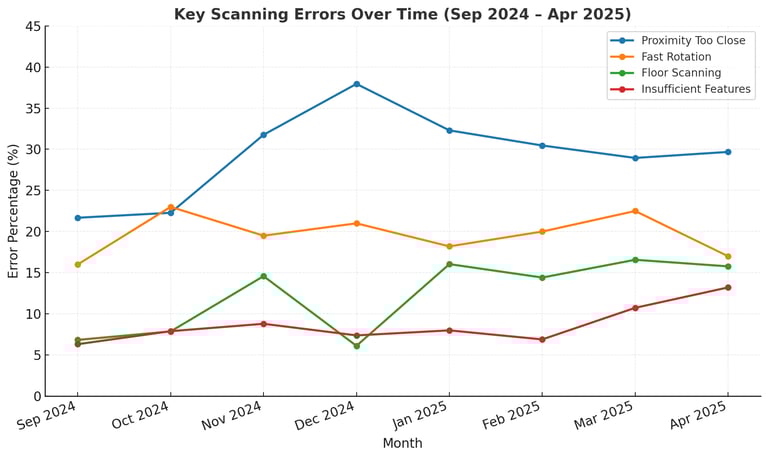
Early insights
Initial data revealed that users frequently repeated the same scanning mistakes without noticeable improvement over time
29% of users scanned too close to objects.
17% rotated too quickly during scanning.
Floor scanning errors peaked in December and January.
Disclaimer: The data presented has been modified to protect company confidentiality.
User problem (JTBD)
When I scan my home, I want clear guidance on how to do it correctly, so I can receive an accurate floorplan without delays.
Co-designing with Customers
Through interviews with our customers, I uncovered recurring pain points in the scanning process. These insights guided the design phase.
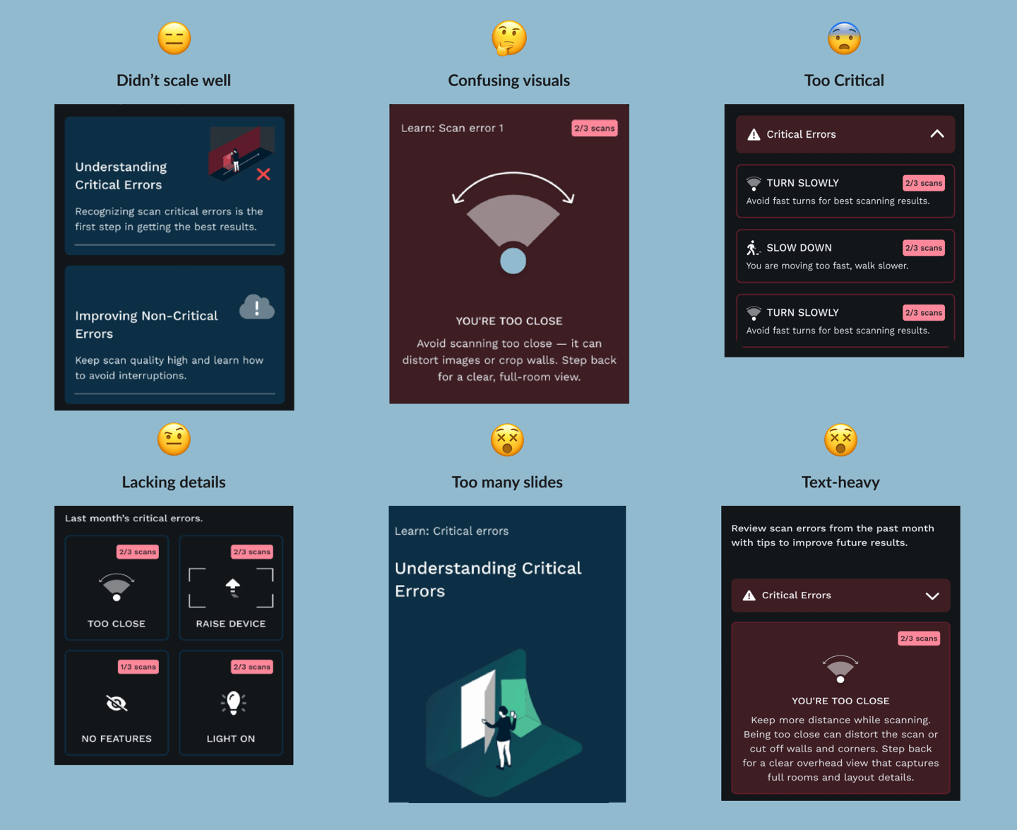
The first designs I explored were using a longer education approach. While these helped with more information, they didn’t perform well during usability tests.
What I learned
Exploring and validating designs through usability testing
Key User Questions
Hypothesis after interviews
Insights that guided decisions
Solutions
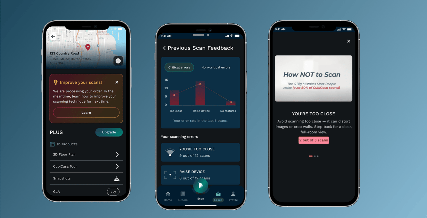
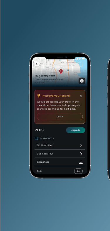
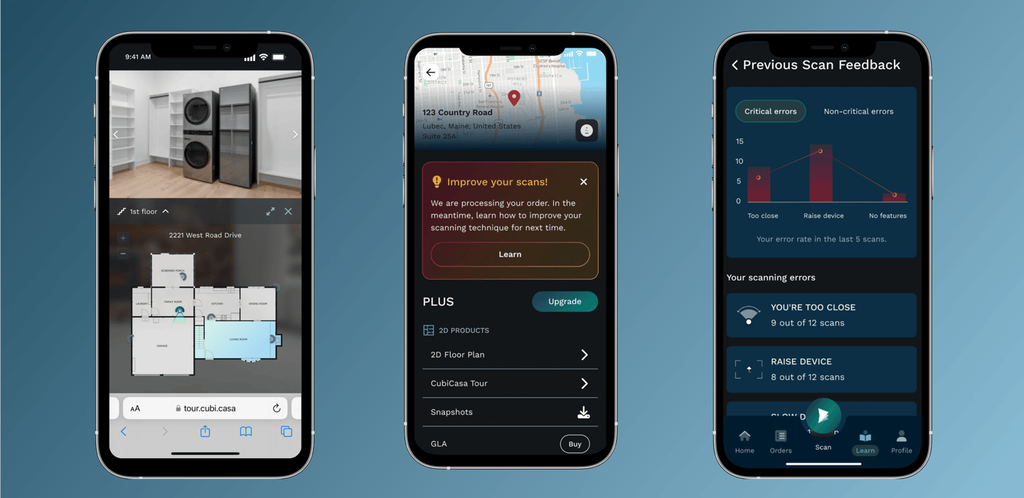
I finally landed on a design for scanning error feedback. Why?
It allowed users to revisit and understand past errors at their own pace — not just during the scan.
It emphasized clarity through visuals and summaries rather than technical terms.
It addressed the core issue: repeated mistakes due to unclear, fleeting in-scan messages.