
Rethinking Environmental Learning for High-schools
At ASE, I contributed to an award-winning virtual cave tour and led the redesign of the non-profit association’s website, making environmental resources more accessible and engaging for students and the public.
High school students struggled with geology content that felt overly technical and disengaging, making it difficult for the non-profit ASE to communicate the importance of the environment in a meaningful way. The challenge was to design a digital experience that simplified complex concepts, engaged students, and supported ASE’s mission to inspire curiosity about the natural world.
Team
Results
Industry
Education · Virtual Reality
UX/UI Designer (myself), Speleology team, Founder of ASE, Virtual Reality crew
Duration
2022 / 4 months
Problem Statement
Skills
User research
Usability testing
UX Audit
UX design
Discovery and Research
To establish learning patterns and understand how students engage with natural environments, we organized hands-on workshops with highschoolers.
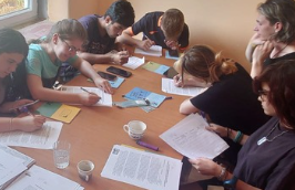
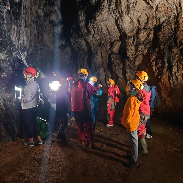
Through these workshops I identified key user needs. It was clear that we needed a clear, engaging, and accurate experience without overwhelming users.
Getting familiar with educational tools
Q & A and theory workshops
Practical work-shops
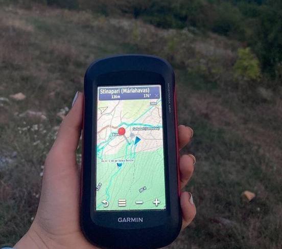
Turning Reality into Virtual
We mapped the cave flow, built the interactive environment with the scanning team, and simplified content based on usability testing.
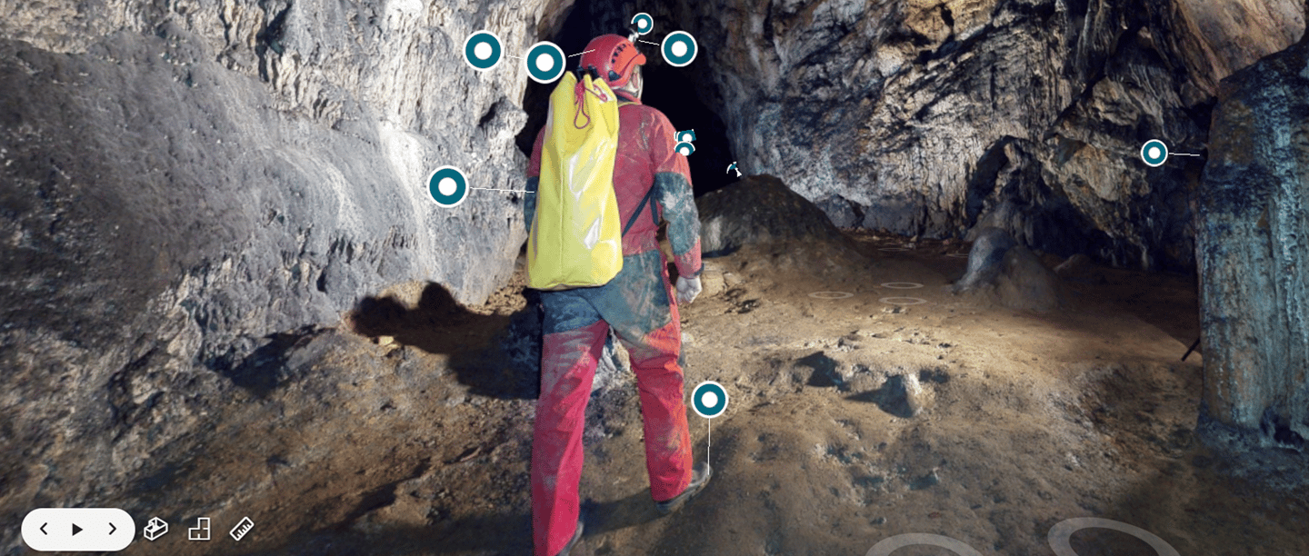
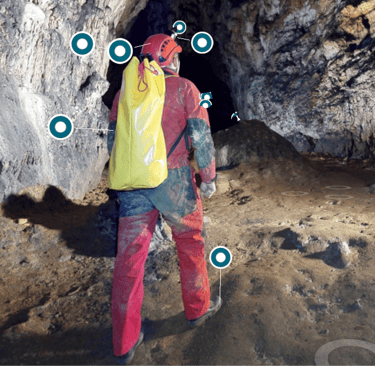
See the whole virtual experience here.
Organization's need
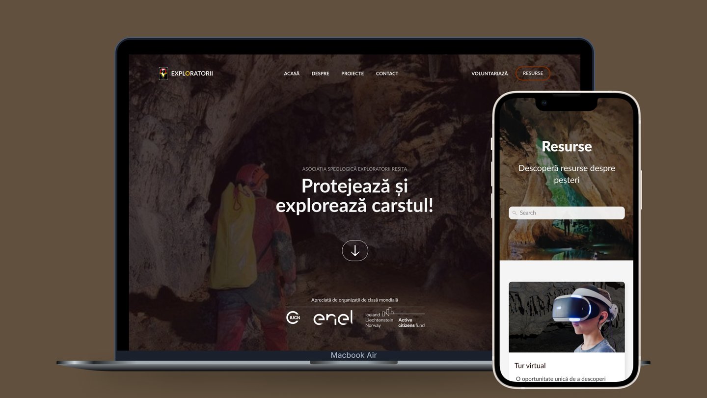
The website was hard to navigate and packed with dense text, making it difficult for visitors—especially educators and potential volunteers—to find what they needed. As a result, 68% left within the first minute, leading to missed chances for engagement
Goal
Redesign the website into a clear and engaging platform that informs the public, supports the mission, and encourages volunteering.
Personal Challenge
Although the founder saw the need for improvement, he was deeply attached to the original website, having written most of it's content. Building trust through open communication, visual prototypes, and involving him in key decisions helped us move forward.
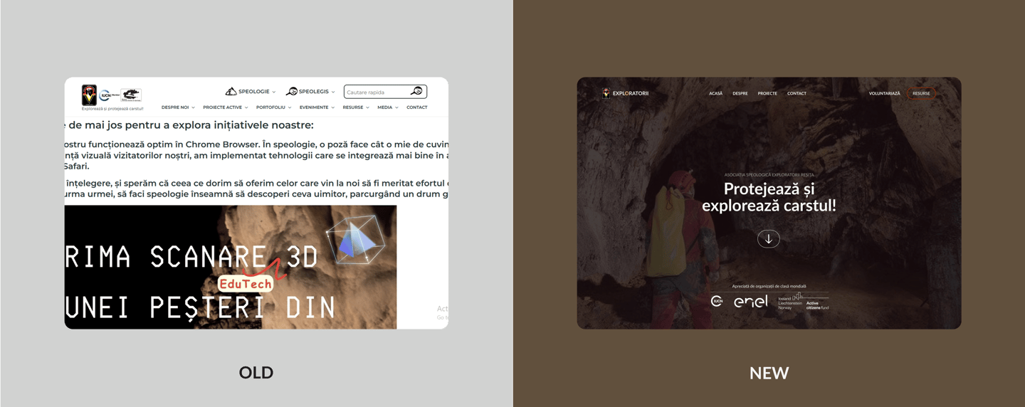
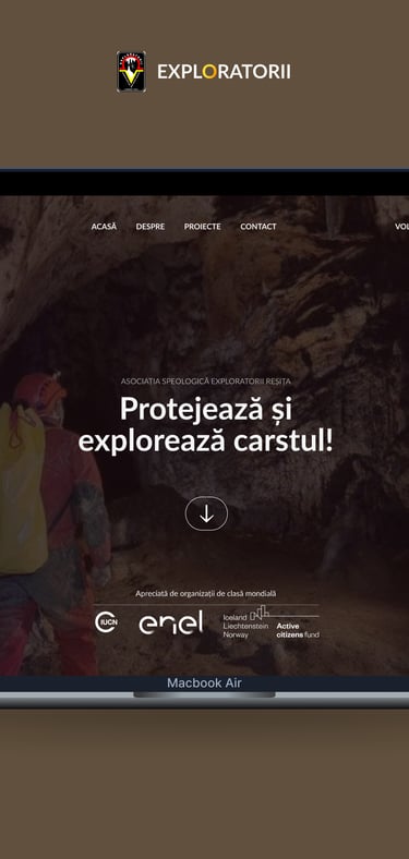
Improving the association's website
Results
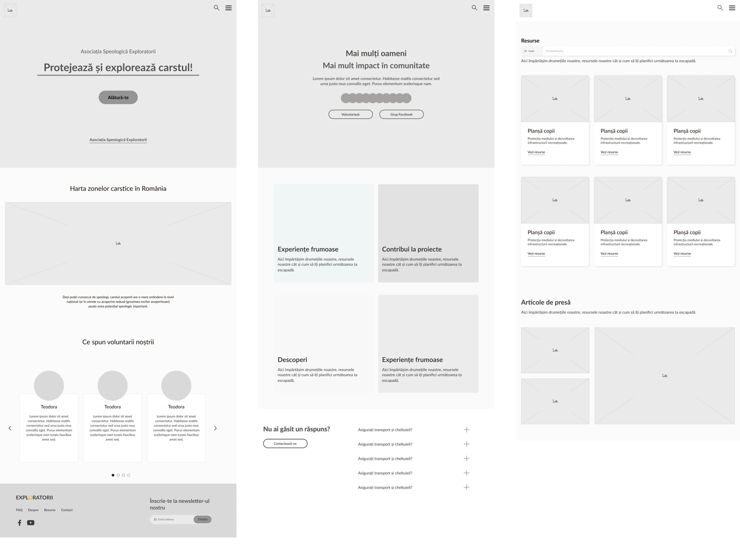
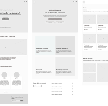
Low fidelity designs
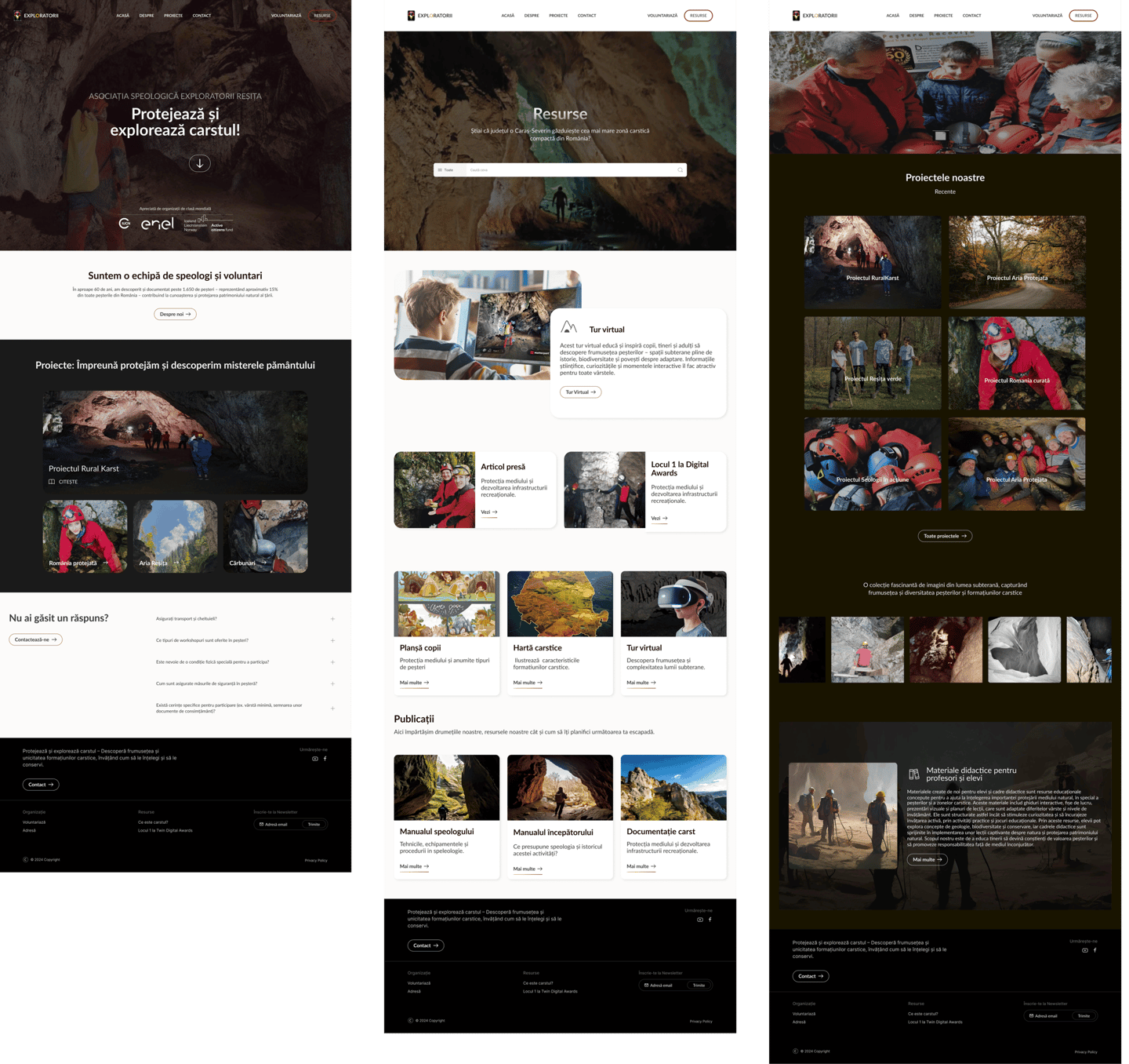
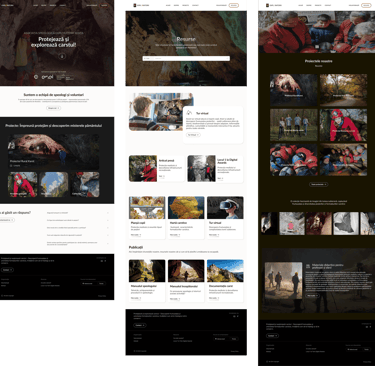
High fidelity designs