
Improving Usability Across Platforms
This case study highlights my contributions to CubiCasa’s mobile and web platform, where I improved scanning reliability, simplified billing, and built reusable components that reduced developer handoff time.
Reducing user scanning errors in Cubicasa's mobile app
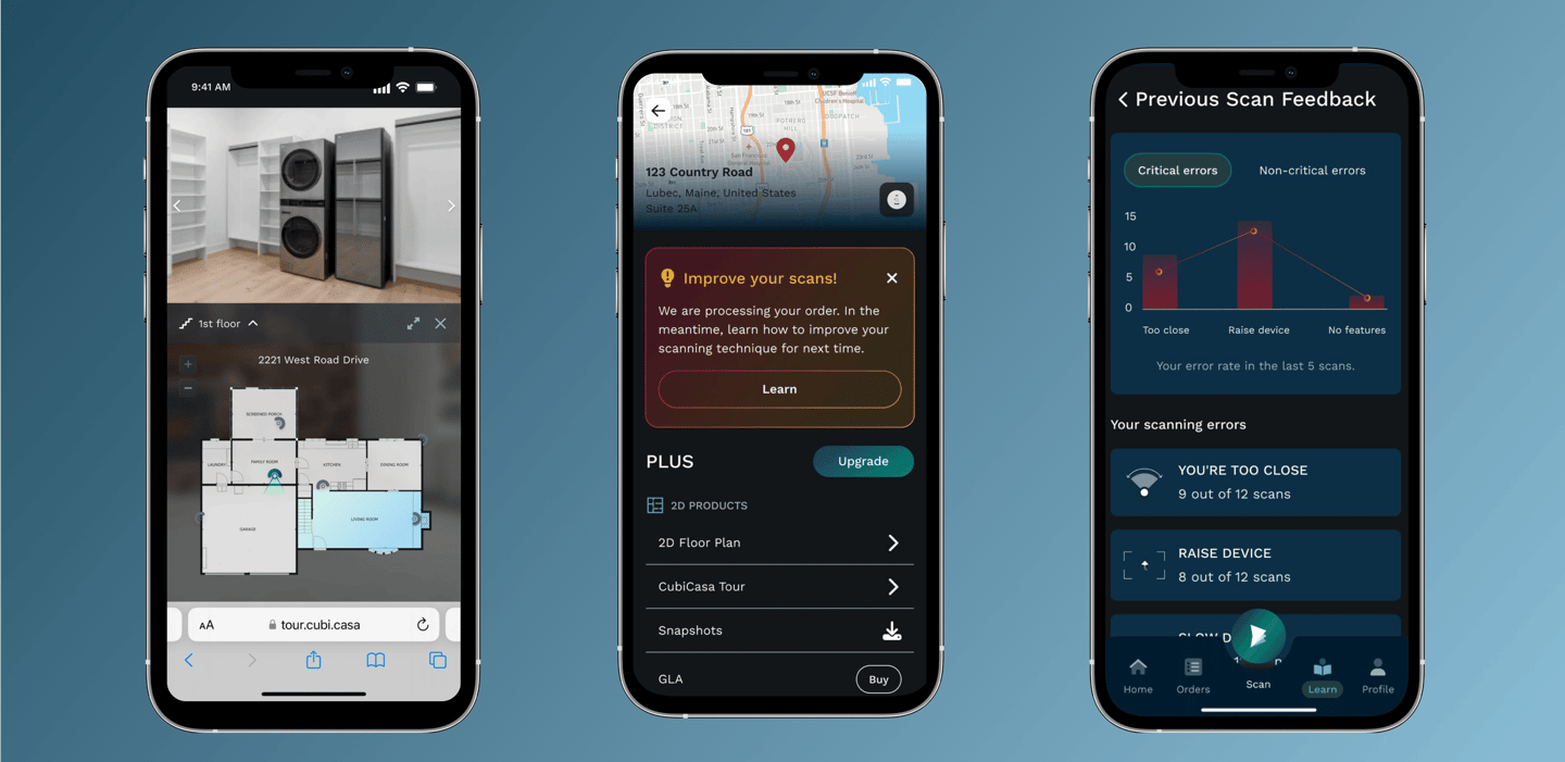
In CubiCasa’s app, users scan their homes to generate floorplans. These scans are refined by the production team before the final floorplan is delivered. Many users struggled with scanning correctly, resulting in errors that delayed delivery, reduced floorplan quality, and increased both the production team’s workload and operational costs.
Team
Results
Industry
PropTech / Real Estate Technology
UX/UI Design (my role), Developers, Product Manager, Data Analyst, Customer Support
Duration
3 months (8 sprints)
Problem Statement
Billing process improvements
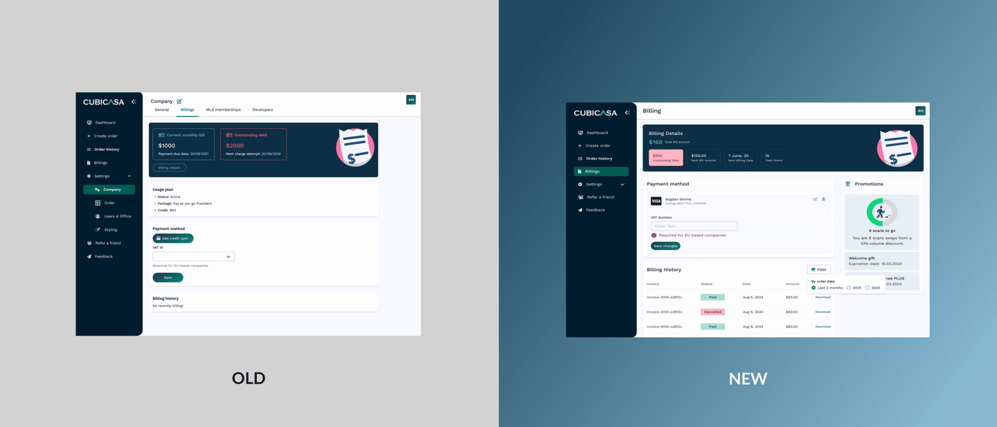
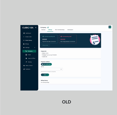
Company need
The billing page was difficult to navigate, with unclear charge breakdowns and hidden promotions, leading to user confusion and frequent support requests.
Goal
Improve clarity, reduce support tickets, and make key information easier to access and manage.
Role
I created wireframes and high-fidelity mockups, collaborating closely with the product manager, development team and customer support team to ensure feasibility and alignment.
Results
Organization need
As the product evolved, both the mobile app and web portal started to show small inconsistencies in spacing and typography. This made it harder to maintain design quality and slowed down collaboration across teams.
Goal
Create components for mobile and web, improving alignment in spacing, typography and reusability.
Role
I created reusable components in Figma, aligning patterns across platforms, and writing use cases for future work. I worked closely with the product design and development team to ensure consistency and clarity.
Design system
Results